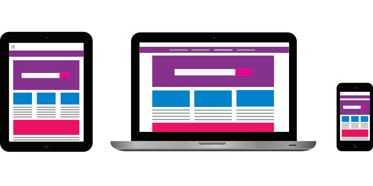
If you want your website to be a powerful online marketing tool it needs to be mobile-responsive.
With the huge rise in the use of mobile devices, you’d be doing your company a disservice if your website is not designed to respond and adjust to mobile devices.
Have you looked at the reduced version of a desktop website on your smartphone? It is far from an optimal experience, and unfortunately, too many companies still have them.
A responsive website is one of your best online investments – and it’s Google Approved!
Here’s a little history. In 2015 Google rolled out a change to their search engine algorithms which now factors in a website’s mobile presence as a ranking signal. The date was aptly named Mobilegeddon.
What was Mobilegeddon? Google posted the message below on the official Webmaster Central Blog and explained the update in brief detail accompanied by a picture to show the difference between what mobile-friendly was and wasn’t:
“Today’s the day we begin globally rolling out our mobile-friendly update. We’re boosting the ranking of mobile-friendly pages on mobile search results. Now searchers can more easily find high-quality and relevant results where text is readable without tapping or zooming, tap targets are spaced appropriately, and the page avoids unplayable content or horizontal scrolling.
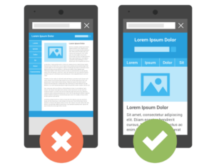
April 21st’s mobile-friendly update boosts mobile search rankings for pages that are legible and usable on mobile devices.”
Google is obsessed with improving the user experience as much as possible and aligning it with user behavior and trends in the market.
By taking note of what Google wants to present to its searchers, you can provide a seamless user experience to leads and prospects!
Unresponsive websites distort the way your website appears on mobile devices.
The text gets jumbled, images are in the wrong place, and users have to pinch, squeeze, and scroll to search for the information they need. This frustrates a prospect and leaves them wondering if your company is the right one to hire.
After a bad experience like this, do you think your prospects will come back to your website? You know what the answer is.
It’s worthwhile to evaluate your website. The benefits of a mobile-responsive site will last for years to come and outweigh your investment in having it done right – right now!
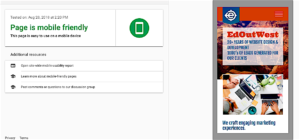
Test your site here:
Enter your website’s URL into Google’s Mobile-Friendly Test. It will let you know if you’ve got a mobile-friendly website.
If the website you entered passes Google’s test, you will see a green banner indicating the website is mobile-friendly. This is what it looks like:
If your website does not pass, Google will let you know the page is not mobile-friendly, give some reasons why and what the problems they’ve encountered with your site.
What do you do to stay ahead of your competition and present your business as a relevant resource for your prospects?
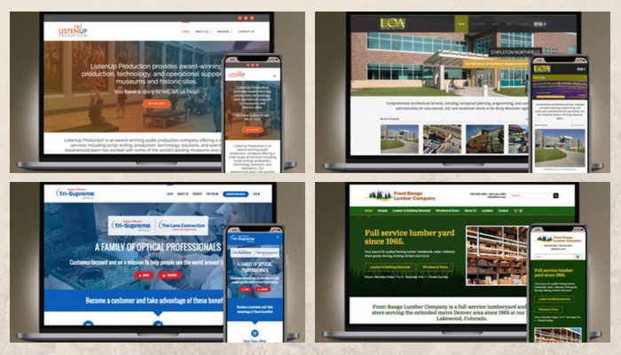
Hire a reputable website design firm that knows the ins and outs of mobile-responsive design AND marketing.
It’s a lot more than just making a nice looking site – it must become your full-time marketing tool that produces the results you’re looking for.
Unfortunately, there are lots of people out there who think they can just get a WordPress theme and create a website for your company. A great website requires so much more than that! We see it every day: They know WordPress but they don’t know how WordPress works.
Keep these things in mind when searching for a website design firm:
- Look at their work on your smartphone and tablet
- Ask them if they outsource out of the country.
- Ask how long they’ve been in business.
- Get a firm price, not a price range. If they know what they’re doing, they will ask the right questions and be able to provide a firm price that meets your budget.